ncsu.edu Redesign
When we redesigned ncsu.edu, our goal was to create an innovative, purposeful Web experience that reflects the university itself. We approached content strategy, page design and site development with the aim of making it easier for users to find the information they need. We also made ncsu.edu a flagship example of NC State’s brand.
Learn how University Communications can help you improve your site.
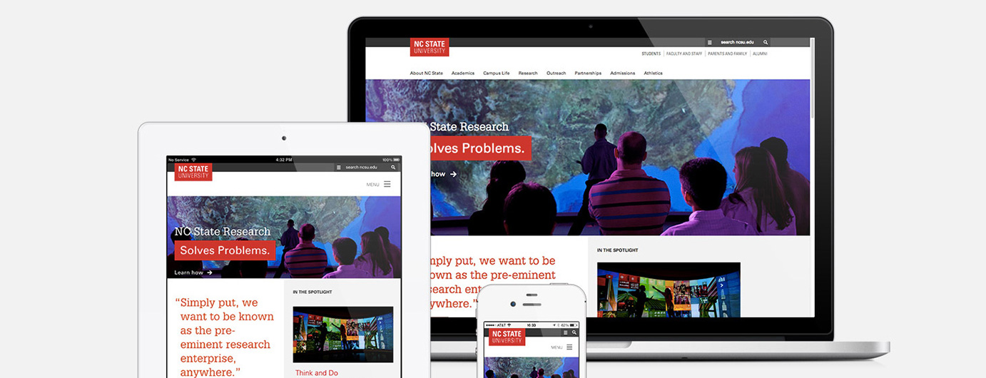
Because of its responsive design, ncsu.edu works optimally on a wide variety of devices.
Sitewide Elements
The brand utility bar provides a search field and a set of Resources links that give access to a variety of important online assets, including the campus directory, MyPack Portal, the NCSU Libraries site and the Giving site.
The Resources links are tucked away behind the "hamburger" icon to keep the page uncluttered and to facilitate categorization of the links in a way that helps users find information. Hiding the Resources links also makes it easier to expand the list of links as more digital resources come online.
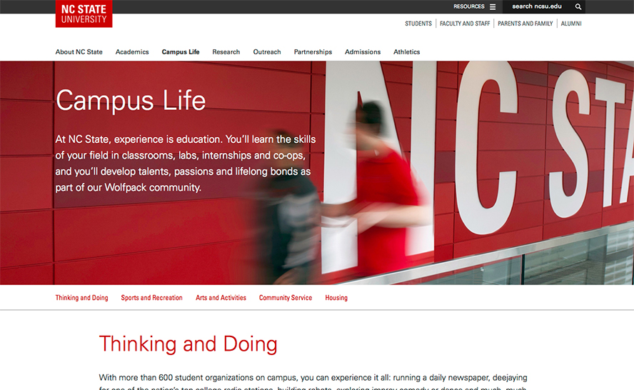
The red NC State brick logo should always be placed in a prominent position. The upper-left-hand corner works well because it’s a natural first place for users to look when they land on a page. Placing the logo in that spot also puts it on top of the “NC State Home” link on the brand utility bar, which simplifies the user experience, especially on the NC State homepage.
To learn more about brand guidelines governing logo usage, visit the Logo page.
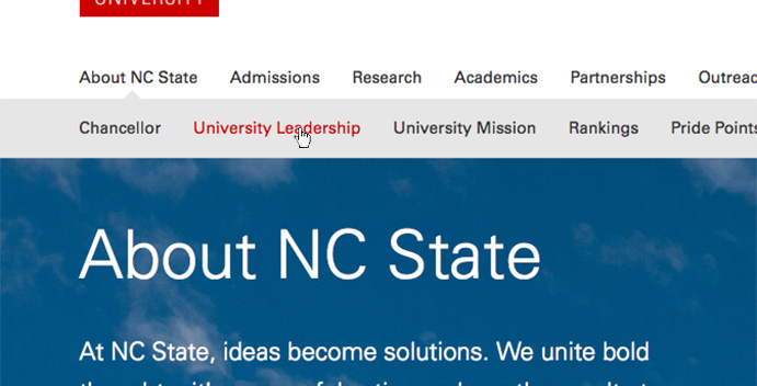
Our primary navigation bar highlights the eight most important sections of the website, categorized by topic. We wanted to make it as simple as possible for readers to find the specific landing page they need. When necessary, we use a subnavigation bar below the primary navigation bar that helps users dig deeper into sections that contain a large amount of information.
Below the large image on each topical page, there’s an in-page navigation bar with links to each section of that page. As the user scrolls down, this navigation bar moves to the top of the page and stays visible there, allowing content to scroll underneath it so the user can access these links from anywhere on the page.
We also have an audience-specific secondary navigation bar in the upper-right-hand corner of the new website, tailored for users in our four key audiences (students, faculty and staff, parents and family, and alumni).
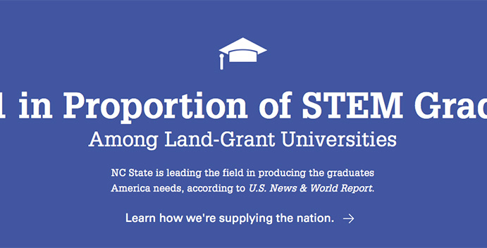
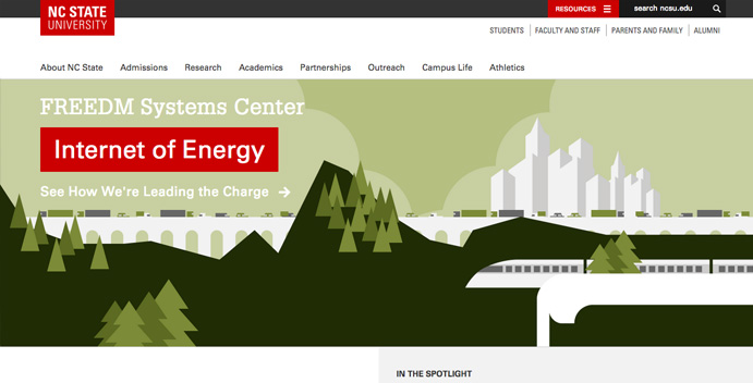
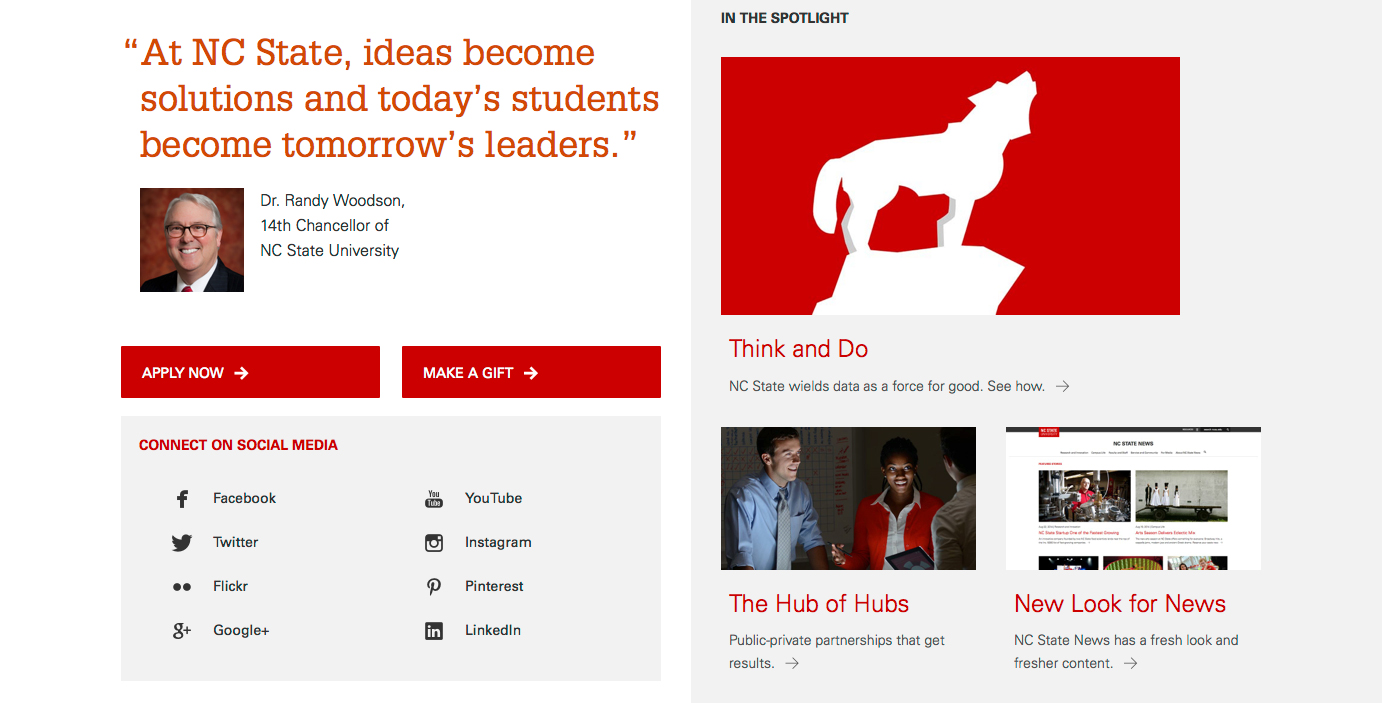
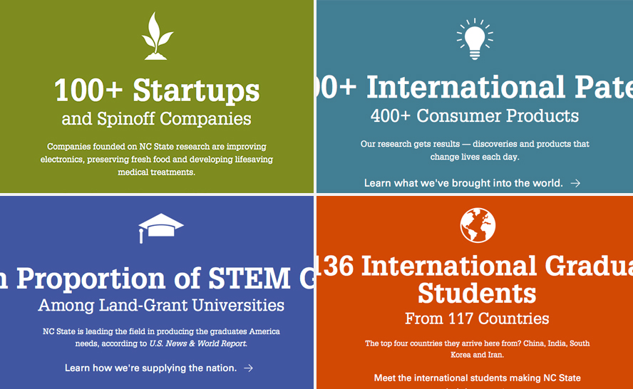
Fact modules highlight facts about NC State that present us in a positive light. They also provide a visually compelling presentation of the kinds of content that people want, such as rankings and numbers. Our social media analytics have shown that people like to consume and share easily digestible facts, and fact modules convey that content in an appealing manner.
We use fact modules to reinforce the messages in the content on a page or in a section of the page.
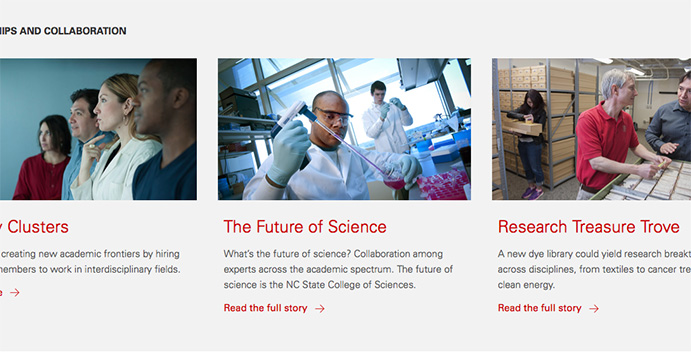
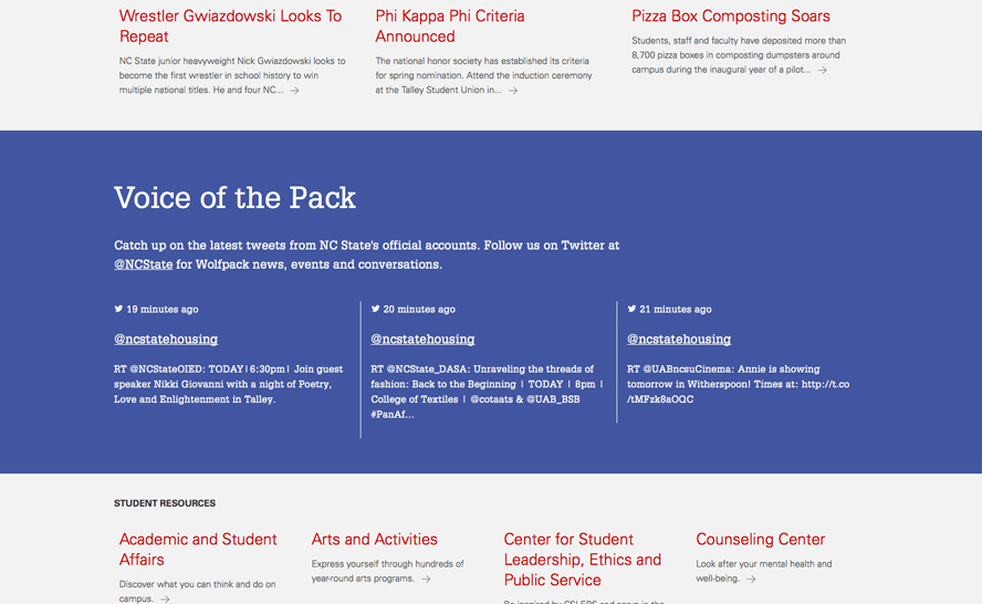
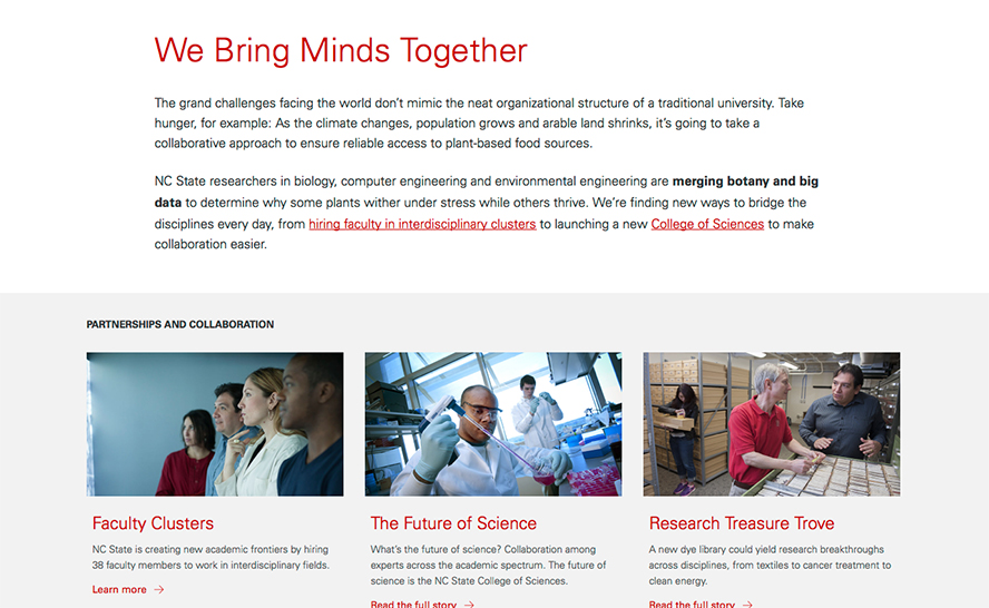
Our analytics show that the average user of the ncsu.edu site visits a total of two pages on the site: the homepage, and one other page. We want to give that average user as much information and utility as we can during their visit, and the related-content modules provide a convenient, user-friendly way to do that. These modules expand on the content presented in the main body copy on the page and link out to places where users can access more information on that topic.
A related-content module always comes at the end of a section, relating to the content above it and anchoring that part of the page. The modules are introduced by labels that clearly tell what the content is about and how it’s related to the content above it.
Voice and Tone
Every piece of writing has a voice and a tone, just as people do. Writers create voice and tone through word choice (e.g., sophisticated vs. basic vocabulary), sentence structure (e.g., complex sentences vs. simple ones) paragraph length (how long you “talk” before pausing) and other writing techniques.
Your voice and tone convey a sense of who you are and what your personality is like. The voice and tone on our website convey a sense of NC State as it’s described in the brand platform: a pre-eminent research enterprise that creates prosperity by being courageous, innovative, intellectual and purposeful.
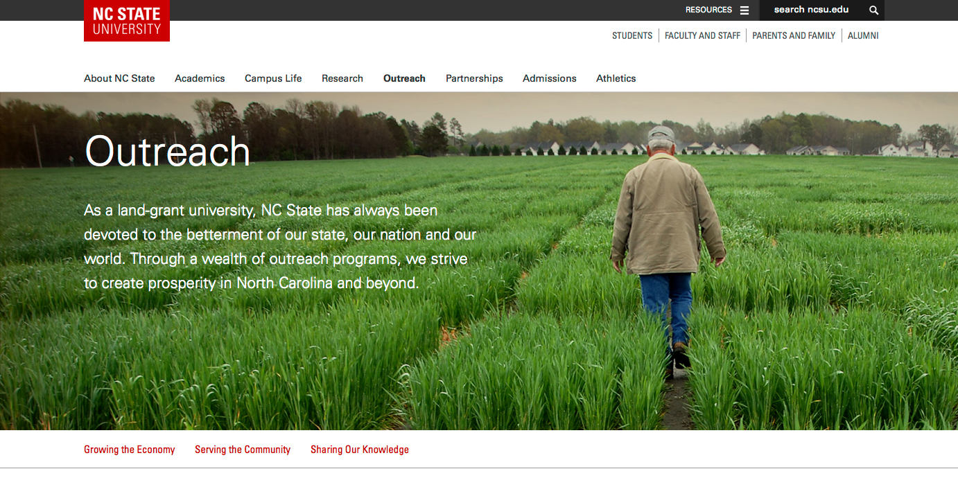
For instance, this copy on our Outreach page depicts us as purposeful by repeatedly showing NC State performing different actions on a variety of direct objects: We are growing the economy, teaching our students, training the workforce, launching 100+ companies, creating 400+ products. We act with purpose to get things done, and our voice and tone tell you so.
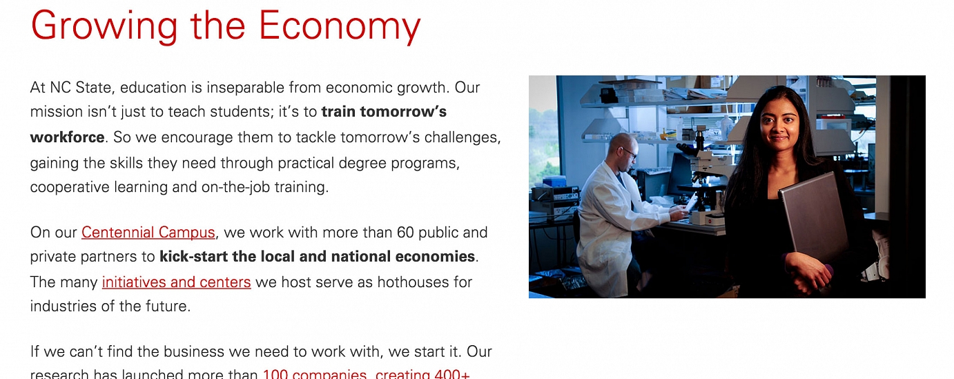
Read an excerpt from the Outreach page.
Design Conventions
At NC State we let our content speak. Function outweighs flair, and legibility and simplicity are the essence of our approach to design. Our goal is to clarify the complicated for our audiences, providing a simple yet aesthetically satisfying Web experience.
We designed the new layout with consistent spacing to keep elements aligned to each other. Twelve columns and horizontal spacing blocks form a functional grid that allows users to consume content more easily without missing the aesthetic impact of the graphic elements.
Mobile Web traffic is constantly increasing, so we took a “mobile first” approach to every aspect of the redesign. Content is chosen and presented in a mobile-friendly way, and pages are designed to be responsive across a variety of platforms and devices.
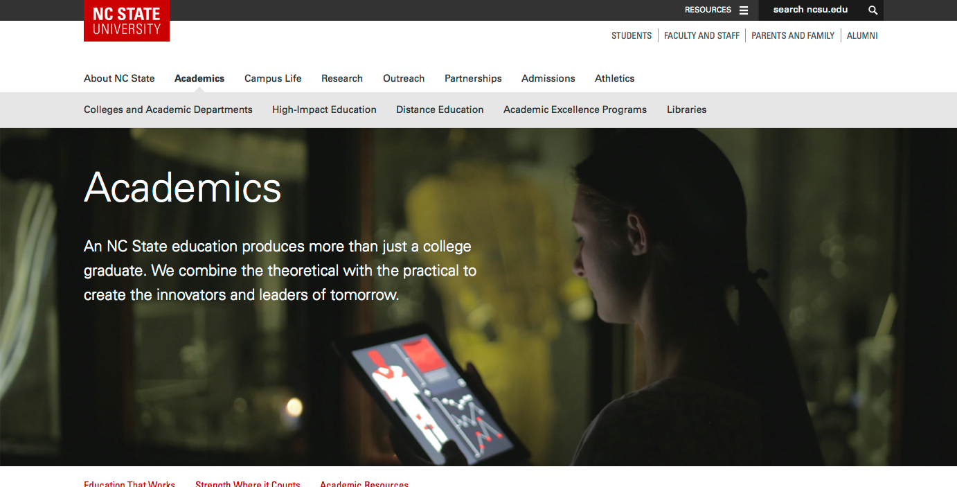
We use clean design with large images and a distinct type hierarchy. The site has fewer pages, and there’s stronger, more compelling content on each page.
Our page designs are simple and uncluttered. We deliver a streamlined message by using large headers, carefully chosen images and easily digestible amounts of copy. We also use solid blocks of color and ample white space to cut down on visual clutter.
Color
Red is dominant
We reinforce brand identity by making Wolfpack Red the dominant color in our design. We use Wolfpack Red as a design element, to call out important information and to designate utility within the site.
The expanded palette complements the core
Our secondary palette consists of six colors that complement each other while also complementing the core palette (Wolfpack Red, Black and White). The secondary palette colors are used for fact modules, social media modules, pull quotes and other supporting elements.
Secondary colors are used equally
The colors of the secondary palette appear in equal amounts throughout the site. This color distribution adds aesthetic variety to the site while reinforcing the brand philosophy that red is dominant.
Typography
Univers is dominant
Our primary typeface, Univers, accounts for 90 percent of the type on the site. Different sizes and versions of Univers are used to distinguish different types of content.
Glypha distinguishes content
We use Glypha as a secondary font to differentiate pull quotes, fact modules and social media modules from the primary content of the website. Please refer to our Typography page for additional information about Web use of Glypha.
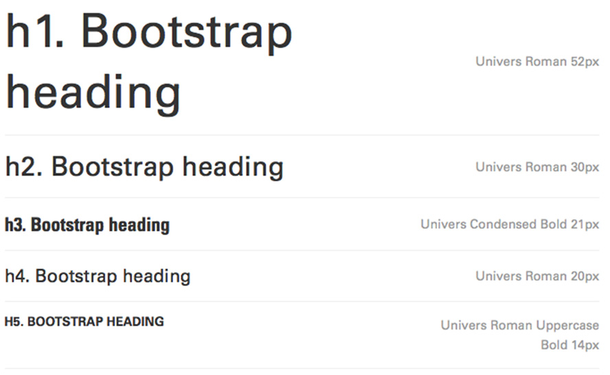
Fonts arranged in hierarchy
There are five levels of font hierarchy within the site. Variations in font face, style and size make it easier to organize and consume content. These styles are controlled by Bootstrap — a set of predefined Web styles customized specifically for our brand.
Imagery
We use bold, singular images to tell our stories with clarity and impact.

By using images of the world beyond NC State, we emphasize our partnerships across the government, private and nonprofit sectors, and we call attention to the impact of our work throughout the state and around the globe.
We use photographs with bright lighting effects to convey optimism and forward motion.
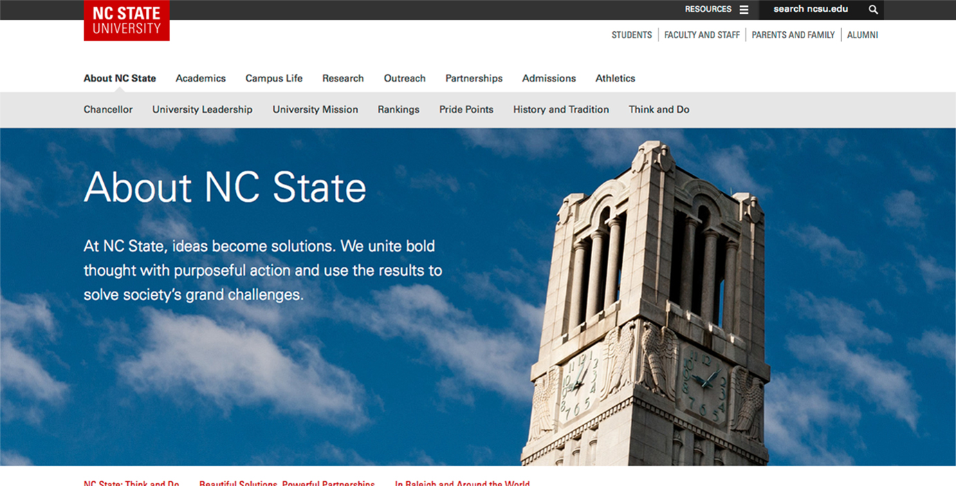
Perspectives that lean back to look up, bend over to peer down, or lean to the left or right can lend a sense of motion to an otherwise static image. Here an upward perspective on the Belltower with a vast blue sky behind it suggests the limitless possibilities at NC State.
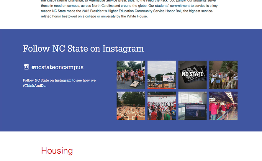
To modernize our Web content, we’ve highlighted the content of our social channels on special modules throughout our new site, giving users a ground-level look into daily life at NC State and letting the voice of our audience be heard by all.