Typography
Our typographic identity reflects NC State’s place as a bold, modern, straight-talking institution.
Primary Typeface
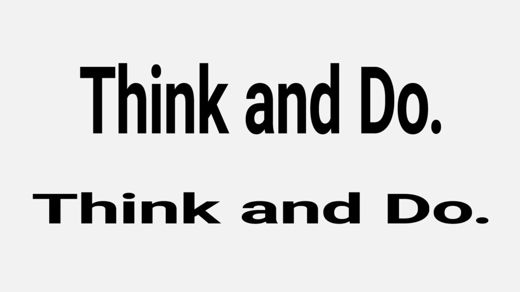
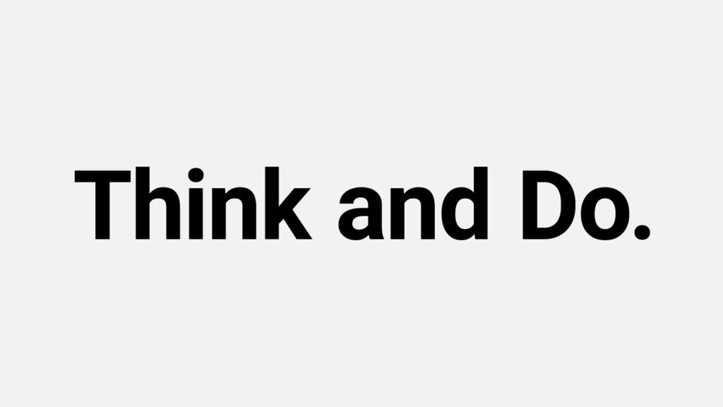
NC State’s primary typefaces are Roboto and Roboto Condensed. These should be used most prominently in any design. The type hierarchy of a piece should start with one of these two fonts, and they should always be used for extended body copy.
- Roboto Thin
- Roboto Thin Italic
- Roboto Light
- Roboto Light Italic
- Roboto Regular
- Roboto Regular Italic
- Roboto Medium
- Roboto Medium Italic
- Roboto Bold
- Roboto Bold Italic
- Roboto Black
- Roboto Black Italic
- Roboto Condensed Thin
- Roboto Condensed Thin Italic
- Roboto Condensed Light
- Roboto Condensed Light Italic
- Roboto Condensed Regular
- Roboto Condensed Regular Italic
- Roboto Condensed Medium
- Roboto Condensed Medium Italic
- Roboto Condensed Bold
- Roboto Condensed Bold Italic
- Roboto Condensed Black
- Roboto Condensed Black Italic
Secondary Typeface
NC State’s secondary typeface is Roboto Slab. Roboto Slab should be used more sparingly and purposefully. It gives emphasis and personality to pull quotes, captions and facts that stand apart from body copy.
- Roboto Slab Thin
- Roboto Slab Light
- Roboto Slab Regular
- Roboto Slab Medium
- Roboto Slab Bold
- Roboto Slab Black
Roboto, Roboto Condensed and Roboto Slab are bold and geometric in feel, taking their inspiration from the midcentury modern design movement. This makes them an excellent fit for the NC State brand.
Roboto comes in a wide variety of weights. All are acceptable for use, but a general rule is to use regular weight for body copy and bold weight for emphasis.

For body text in print, we recommend using Roboto at 8.5 point or larger with 130% or 160% leading. For body text on the web, we recommend using it at 16 pixels or larger with 130% or 160% line height.
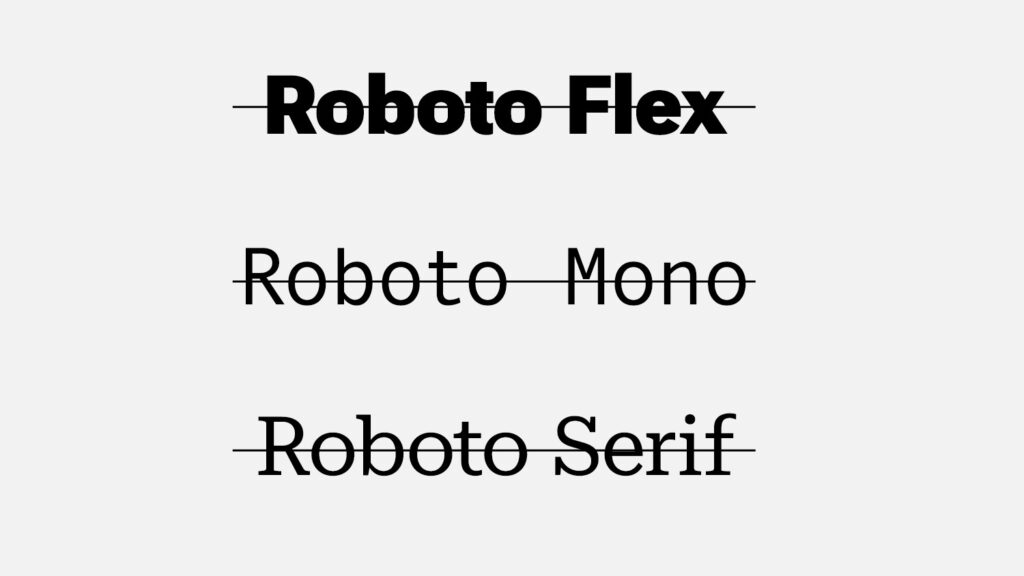
Several variations of Roboto have been designed since the rollout of Roboto, Roboto Condensed and Roboto Slab. We do not use these variations.
The Roboto Slab font family does not include italic versions. If italicization is required in a Roboto Slab type layout, Roboto Italic or force-italicization can be used.
Type Guidelines
We’ve put together some basic recommendations that can better align your use of type with the NC State brand.
We do not squeeze, stretch or skew typefaces when we scale them.
We always scale type in its original, intended proportions.
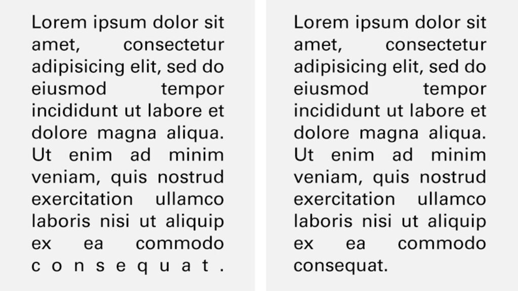
We don’t force-justify copy blocks.
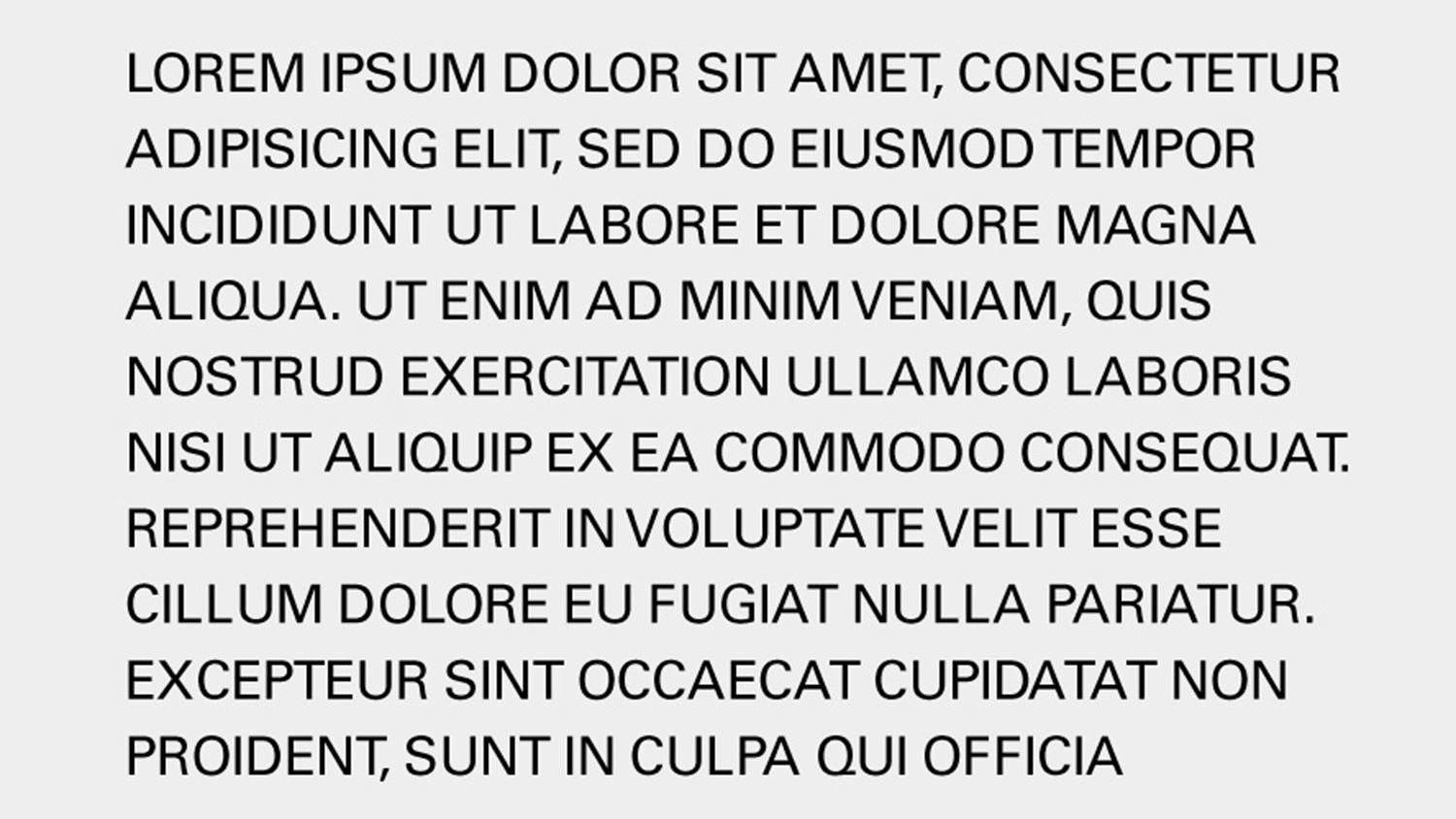
We don’t set body copy in all uppercase.
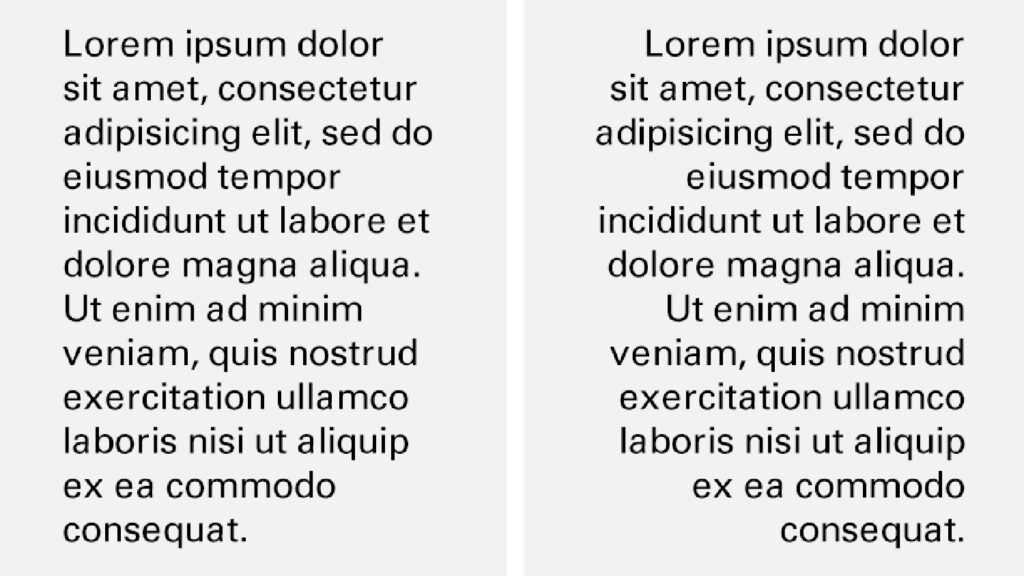
We use title case for headings, sentence case for paragraphs and interface text, and keep copy blocks left- or right-aligned.
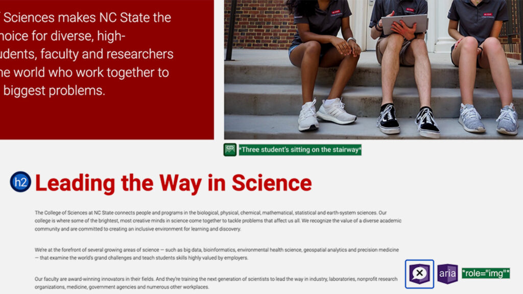
When designing for the web, we test all our type for accessibility. To ensure legibility and Section 508 compliance, NC State adheres to Web Content Accessibility Guidelines (WCAG) Level AA.
We commonly use white type over our brand colors in layout. However, black type must be used over Hunt Yellow to ensure legibility and accessibility.
Downloadable Fonts
Roboto, Roboto Condensed and Roboto Slab are open-source fonts developed by Google. They require no license for use. They are free to download and use on projects of any nature, for any period of time.
Special-Use Fonts
The NC State brand allows for limited, judicious use of four other typefaces for specific design projects. Contact ncstatebrand@ncsu.edu if you have questions about their acquisition and use.
Neutraface is a more elegant, formal typeface that is used for special events and initiatives.
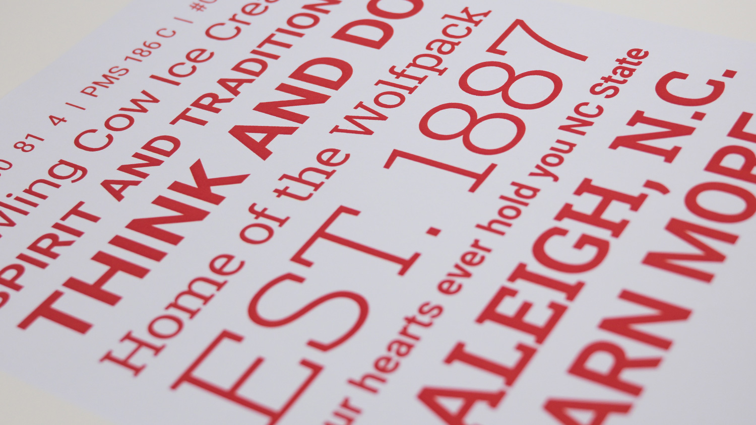
United Serif is the font family most closely associated with colleges and universities during the early 20th century. It is sometimes used on projects that require a nostalgic or spirit-oriented feel.

Univers and Glypha are NC State’s former primary and secondary typefaces. Existing projects using these are acceptable if converting to Roboto would be excessively costly or labor-intensive.
Arial is a typeface that works across all media. It is an acceptable substitute for Roboto when a platform imposes technical limitations on the fonts that can be loaded and displayed.