Design Conventions
NC State is a confident, forward-thinking community — and our design work reflects that.
A Flexible Approach
NC State’s typefaces, colors and imagery can be combined in almost endless ways. But we always consider the messaging, format and audience when establishing a project’s look and feel.
Below, you’ll find some of the principles that routinely inform our design choices.

A clean, straightforward approach is preferred. It’s compelling for the viewer, highly adaptable to different content and reflective of our brand’s key tenets.
This style supports a wealth of different design approaches…
…while still allowing for variations in type, color, spacing and weight to alter the tone of a piece.
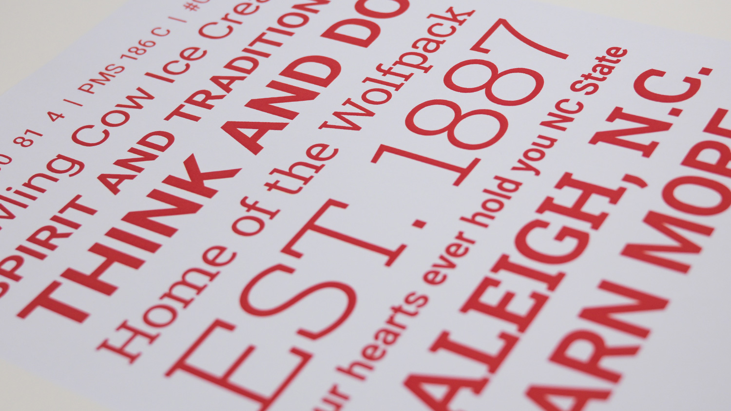
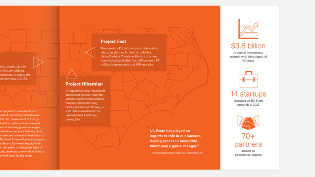
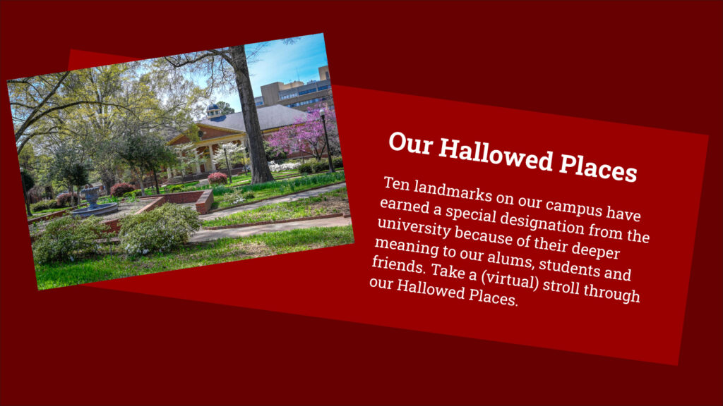
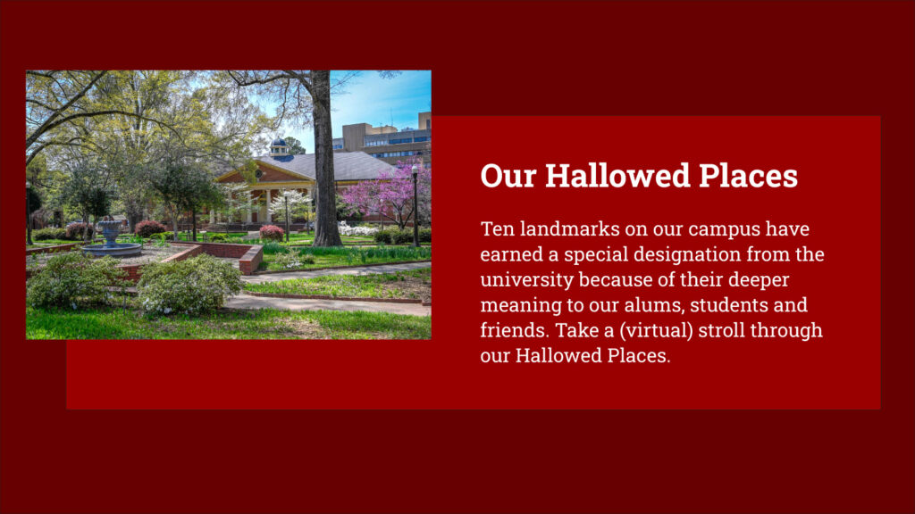
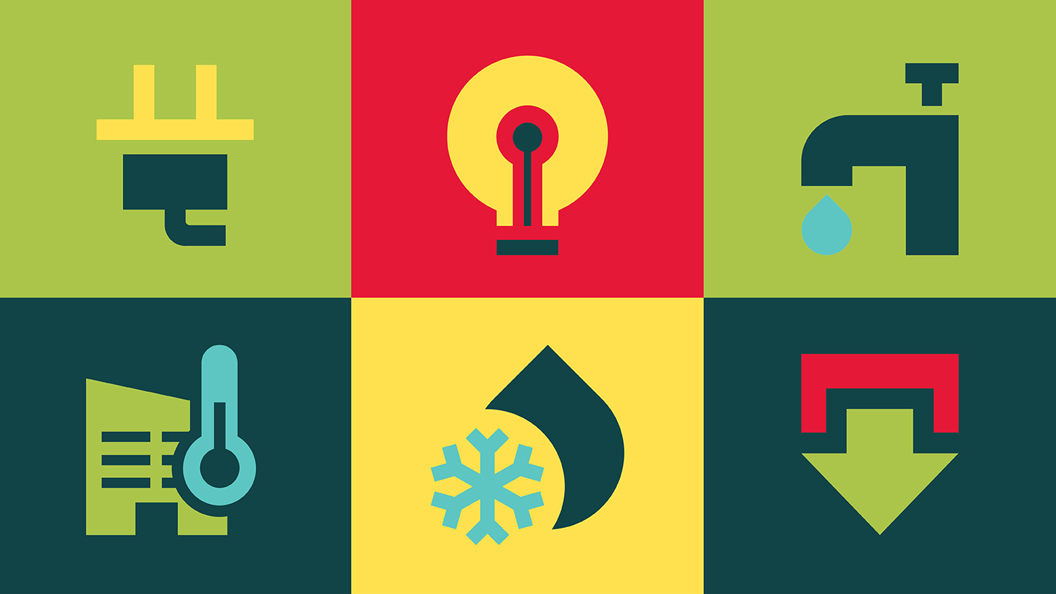
We often use large blocks of color in our design work. Wolfpack Red (and our other palette colors) are eye-catching, even when used simply.
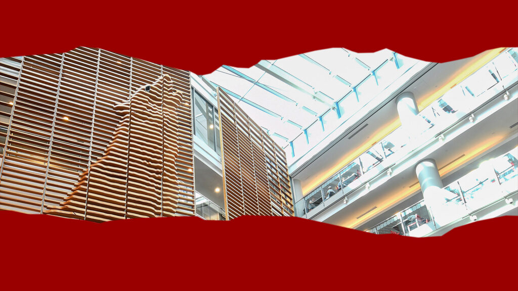
Textures can be applied to elements if they fit the tone of the project. We use texture sparingly so it does not overwhelm the viewer or undermine legibility.
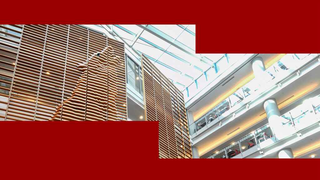
Overlapping or overlaid elements can be employed as needed to guide a viewer’s eye or demonstrate a stronger connection between elements.
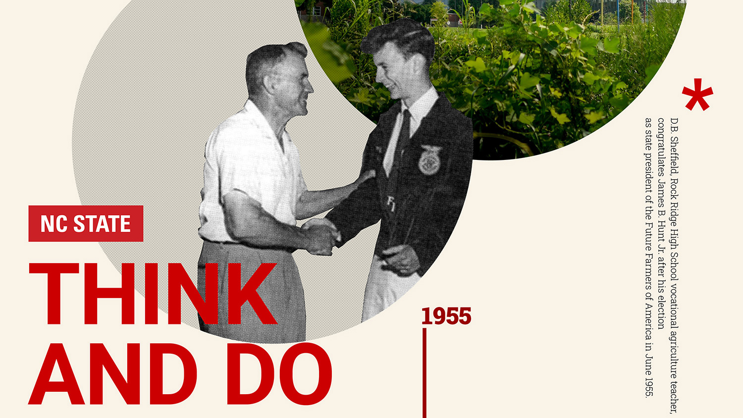
When alignment is treated more freely, and ornamental and cut-out elements are used, our clean and straightforward style can transition to a mixed-media style. While this can work in many contexts, it should always be executed with our design rules in mind.
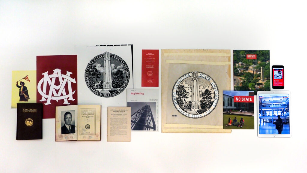
Drawing On Our Roots
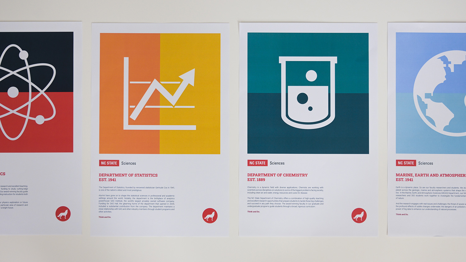
Follow a Grid
No matter how simple or complex a design, we always instill the feeling that there’s a well-planned structure to our visual work. We do this by leaning heavily into the horizontal and vertical.
Clear and consistent alignment can help the viewer grasp the nature of our content — and consume it easily at a regular pace.
Laying out elements on a grid is key to our content design. A well-defined structure makes copy and images easier to parse.
Our floating boxes are never skewed, tilted or thrown down at random.
Design elements are typically perpendicular or parallel to one another.
Our design elements do not feature “live edges” or other irregular treatments.
Design elements feature sharp lines and clean, clear edges.
Use Geometric Principles
The lines and shapes in our design work should always feel like they follow clear rules, conform to grids or suggest an underlying schematic.

Diagonal divisions can add visual interest, but they should always follow a single, straight path.
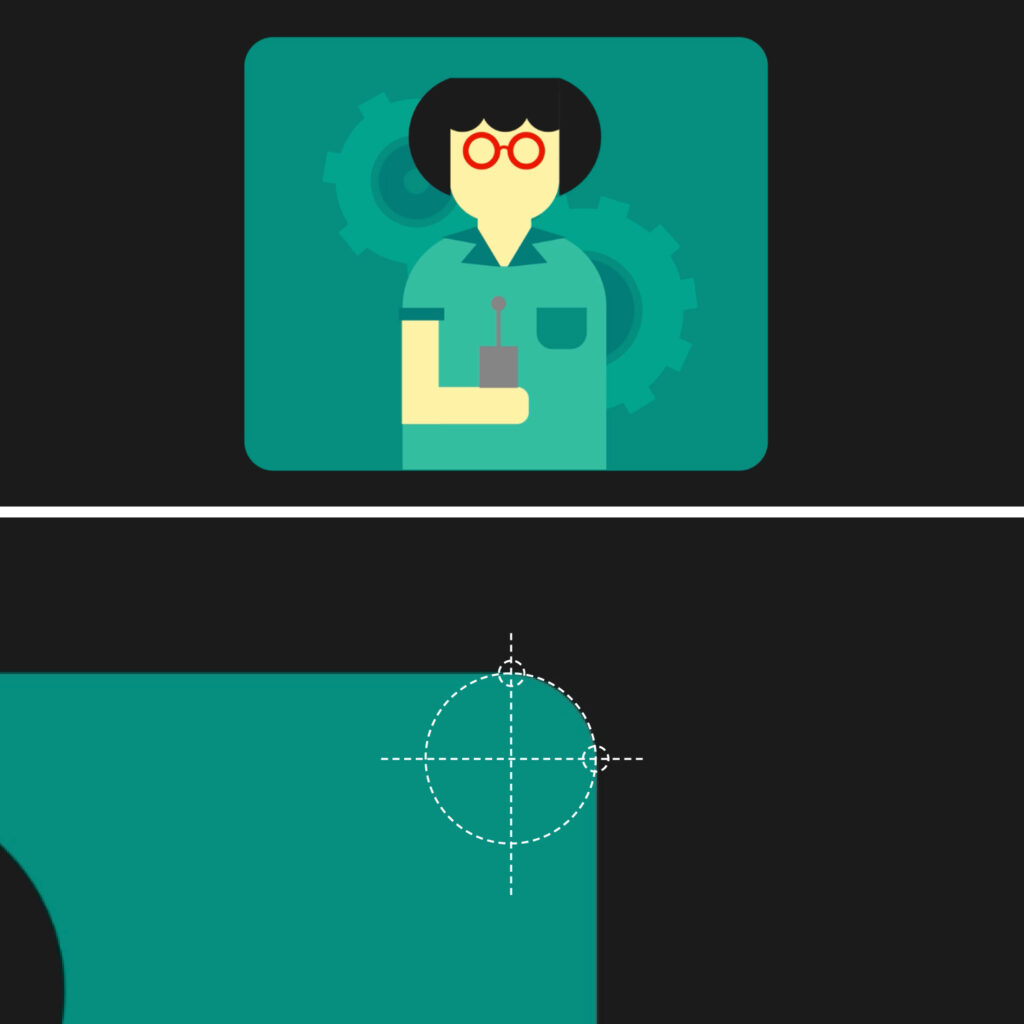
Rounded corners should follow a uniform curve, and identical dimensions should be used for each.
The motifs we employ in our design work are calculated and logical in feel.
Be Straightforward
We avoid using effects that trick the eye into perceiving dimensionality — including elements that hover off the page or respond to unseen light sources.
We don’t use translucent boxes to display type or icons over an image; all design elements should appear at 100% opacity.
Translucency is permitted only when rendering captions for videos or otherwise meeting accessibility standards.

We do not use drop shadows, lighting or other effects to soften design elements.

A drop-shadow effect can be mimicked using offset shapes with hard edges.

We do not use gradient tools to create smoothed transitions between colors.

Transitions between colors can be made using clearly delineated bands of color.