Color
NC State uses a bright, bold rainbow of hues, anchored by our classic red and white.
Our Core Palette
Color is one of the most recognizable elements of the NC State brand. By extracting hues from our university’s history and the people, places and things on our campus, we’ve created a broad palette that resonates visually and reflects who we are.
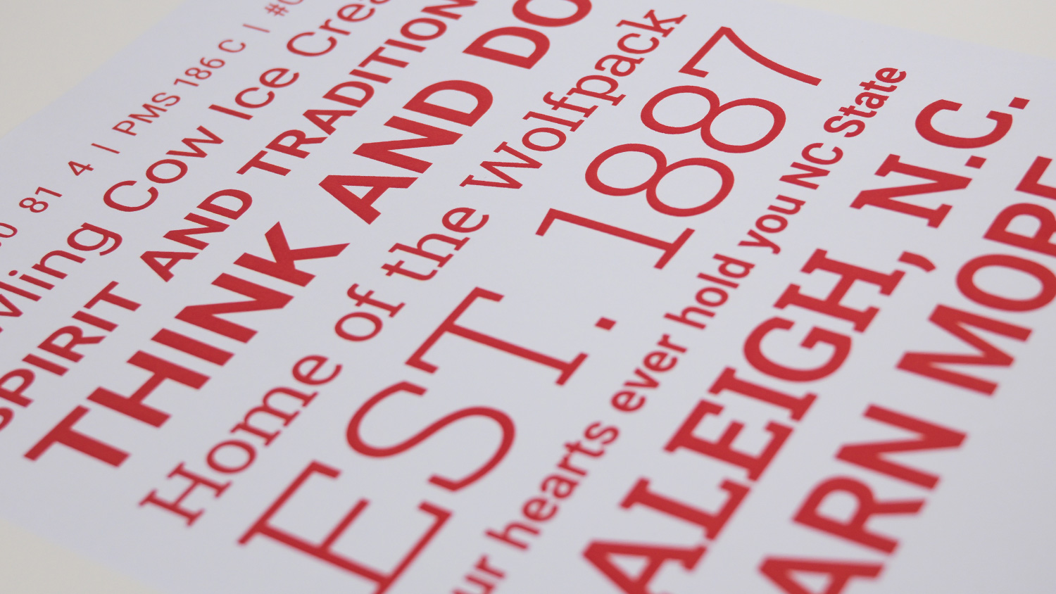
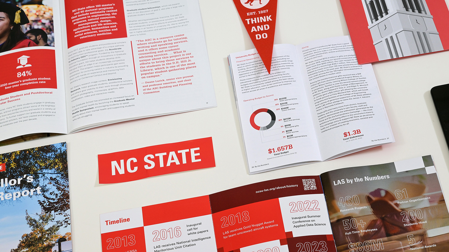
NC State’s core palette consists of three colors: Wolfpack Red, Wolfpack White and Wolfpack Black. These colors should feature more prominently than any others in NC State communications — and Wolfpack Red should predominate.

Wolfpack Red
HEX #CC0000
RGB 204 0 0
CMYK 0 100 81 4
PMS 186 C

Wolfpack Black
HEX #000000
RGB 0 0 0
CMYK 0 0 0 100

Wolfpack White
HEX #FFFFFF
RGB 255 255 255
CMYK 0 0 0 0

Starting and ending any piece with red helps to establish our core color and keep it top of mind — no matter how many other colors are used.

While our design work contains large floods of red, this isn’t the only way to keep it predominant. A well-placed NC State brick logo can help Wolfpack Red pop.
Our Expanded Palette
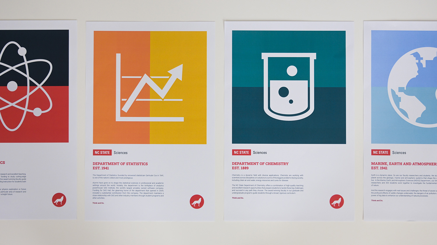
Our expanded palette features seven colors that complement each other — and work well with Wolfpack Red.
Reynolds Red
HEX #990000
RGB 153 0 0
CMYK 24 100 100 24
PMS 7622C
Pyroman Flame
HEX #D14905
RGB 209 73 5
CMYK 0 76 100 0
PMS 166C
Hunt Yellow
HEX #FAC800
RGB 250 200 0
CMYK 0 20 100 2
PMS 7408 C
Genomic Green
HEX #6F7D1C
RGB 111 125 28
CMYK 46 6 100 42
PMS 7496C
Carmichael Aqua
HEX #008473
RGB 0 132 115
CMYK 87 34 51 11
PMS 3282 C
Innovation Blue
HEX #427E93
RGB 66 126 147
CMYK 75 38 26 1
PMS 7697C
Bio-Indigo
HEX #4156A1
RGB 65 86 161
CMYK 86 78 5 0
PMS 2726 C
When designing for the web, we test all our color combinations for accessibility. To ensure legibility and Section 508 compliance, NC State adheres to Web Content Accessibility Guidelines (WCAG) Level AA.

If you use the expanded palette, try to include several of its colors throughout your website or publication. Varying our secondary colors reduces their prominence and keeps them subordinate to Wolfpack Red.


Our Tints and Shades
Our palette colors work well together because they have similar values and vibrancy. When a project calls for a shift in those characteristics, however, you can make judicious use of our approved tints and shades.
| #ea1500 |
| #cc0000 |
| #b40000 |
| #990000 |
| #7e0000 |
| #5e0000 |
| #3e0000 |
| 0 100 81 4 |
| 4 100 90 21 |
| 24 100 100 24 |
| 33 100 100 34 |
| 45 100 100 45 |
| #f8a812 |
| #f28c0d |
| #e16408 |
| #d14905 |
| #c03003 |
| #a91b02 |
| #910e01 |
| 0 47 76 0 |
| 0 59 83 0 |
| 0 76 100 0 |
| 0 78 100 12 |
| 1 84 100 8 |
| #fef8cb |
| #fde565 |
| #f8da3e |
| #fac800 |
| #d7a700 |
| #b88800 |
| #966d00 |
| 0 4 48 0 |
| 0 9 80 0 |
| 0 20 100 2 |
| 1 26 95 10 |
| 0 31 100 25 |
| #bfcc46 |
| #a2b729 |
| #8d9e2b |
| #6f7d1c |
| #586800 |
| #424c09 |
| #2f3a03 |
| 38 7 91 0 |
| 54 24 100 0 |
| 46 6 100 42 |
| 62 35 91 40 |
| 69 52 95 59 |
| #91f2cb |
| #57dab1 |
| #2db597 |
| #008473 |
| #00716d |
| #005b5f |
| #00444c |
| 59 0 29 0 |
| 77 14 42 0 |
| 87 34 51 11 |
| 100 0 38 56 |
| 93 58 61 41 |
| #80c3d4 |
| #6fb2c5 |
| #599baf |
| #427e93 |
| #2d637a |
| #1d4b61 |
| #12394d |
| 48 9 7 2 |
| 67 26 18 0 |
| 75 38 26 1 |
| 85 53 37 16 |
| 94 70 48 41 |
| #84a0dc |
| #728bcf |
| #5b73bb |
| #4156a1 |
| #344891 |
| #24347b |
| #192668 |
| 42 24 0 0 |
| 70 55 0 0 |
| 86 78 5 0 |
| 93 86 10 18 |
| 100 91 29 27 |
| #f2f2f2 |
| #cccccc |
| #b2b2b2 |
| #808080 |
| #4d4d4d |
| #333333 |
| #000000 |
| 0 0 0 10 |
| 0 0 0 25 |
| 0 0 0 60 |
| 0 0 0 90 |
| 0 0 0 100 |

When a single-color treatment is desired for a page layout, illustration or graphic, you can use tints and shades to provide visual clarity.
The breadth of NC State’s units and their work can call for subtle variations in brand color to better suit the tone of a project. This is where tints and shades excel.


Downloadable Palettes
We’ve created swatches that take the work out of getting our colors into the Adobe Creative Suite. To use the files, open the Swatches palette in the software and click on the top right menu. Select “Open Swatch Library” and then “Other Library.” Navigate to where the downloaded file is located on your computer.