Case Studies
These case studies illustrate how design, copy, imagery and type merge to create our overall brand identity. They also display how to translate a single subject across a range of different media. Each of these campaigns uses a strong, simple style to demonstrate NC State’s core message.
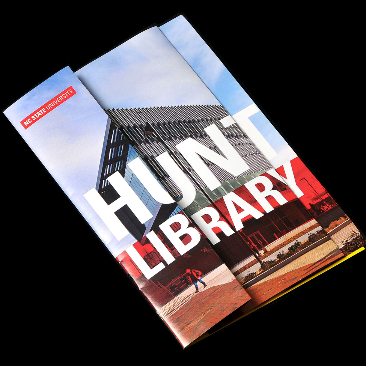
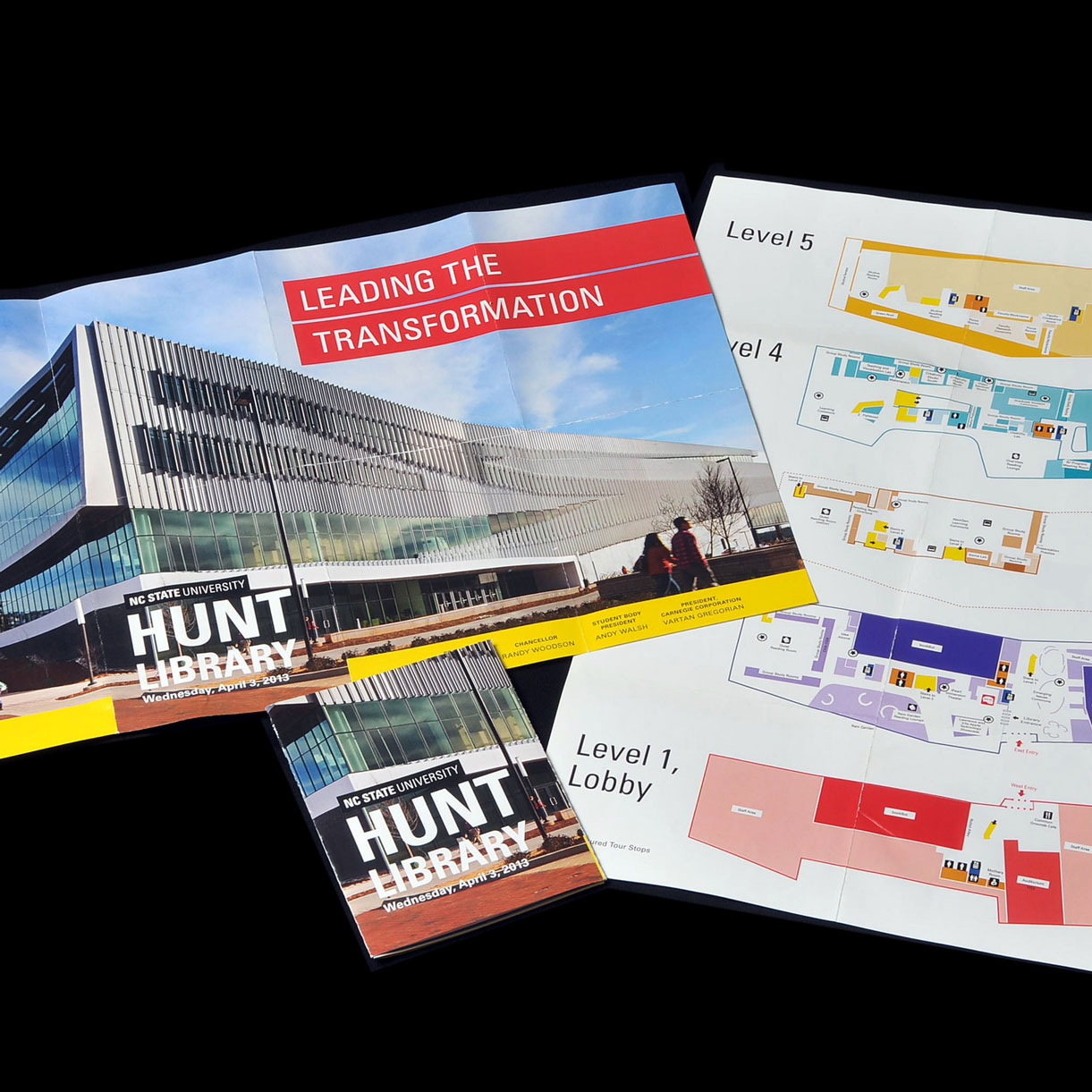
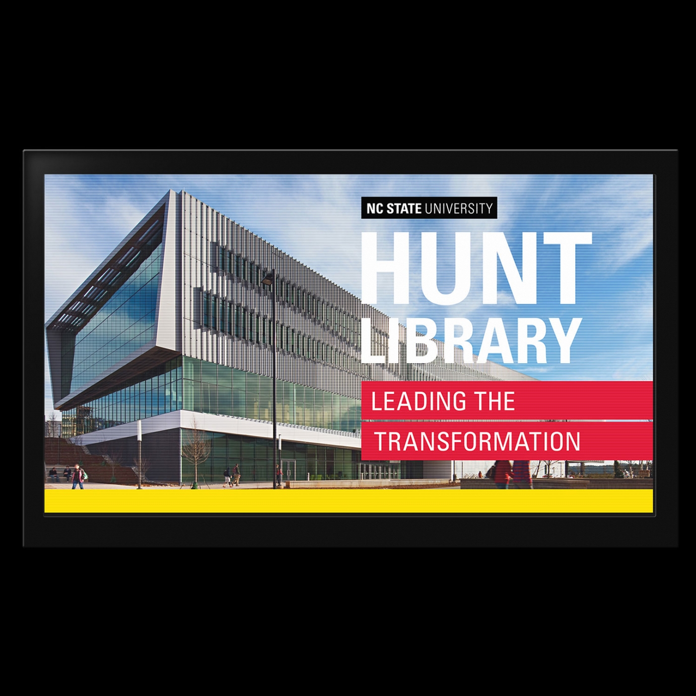
Hunt Library:
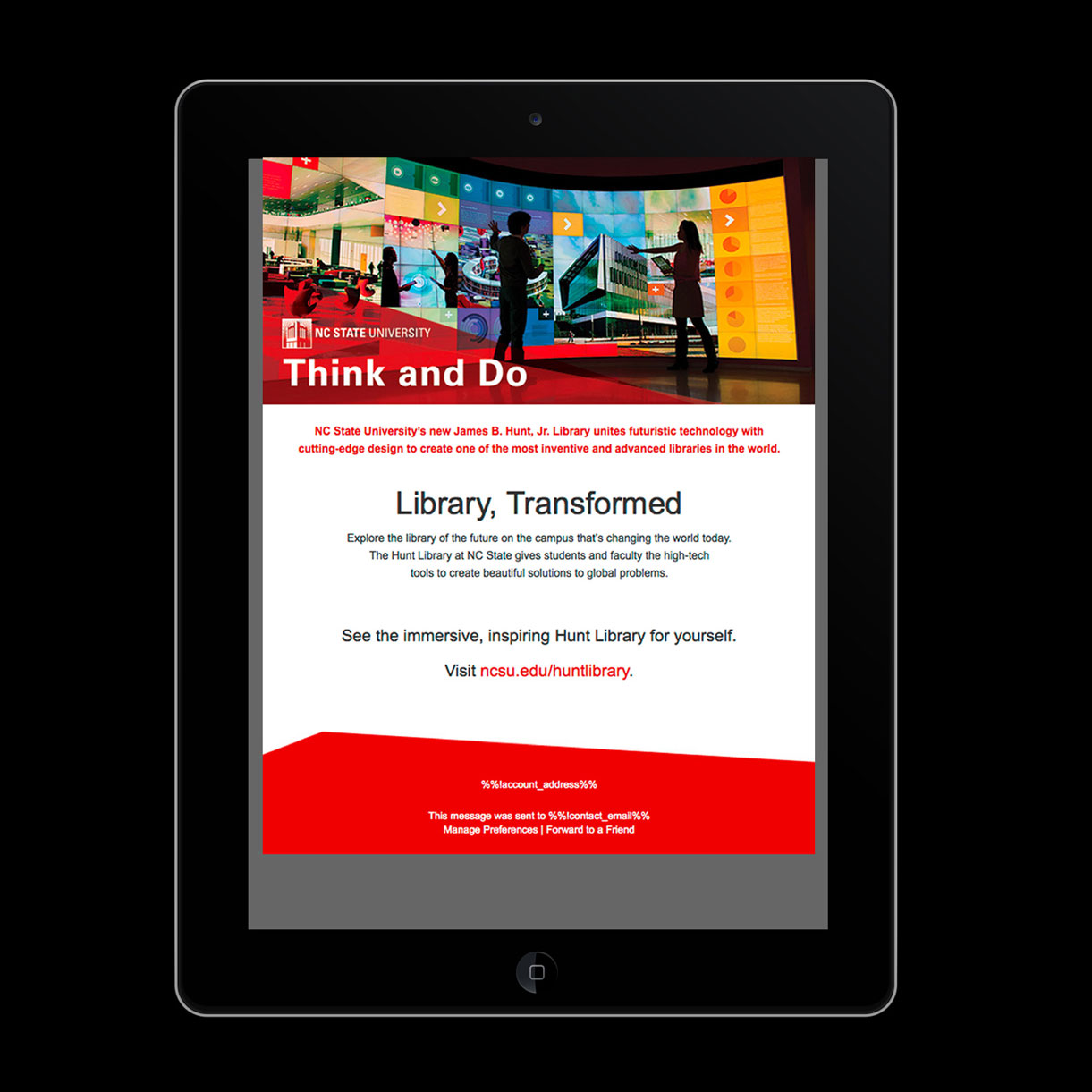
Think and Do
As the Hunt Library opened in spring of 2013, the university embarked on a campaign to celebrate the opening day and, more broadly, to illustrate how the innovative space provides a new direction for how higher education can think about study and work spaces for faculty, staff and students. Every piece used images of the building’s exteriors or interiors, as well as colors inspired by the building’s interior color palette. This palette helped inspire the final secondary color palette in our brand. All pieces use Univers typography.
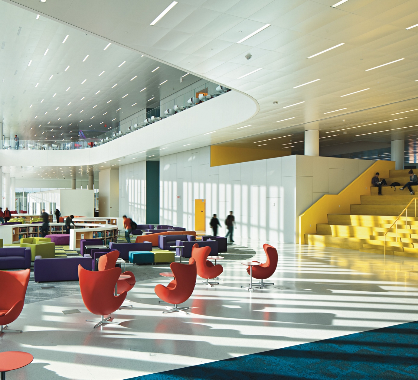
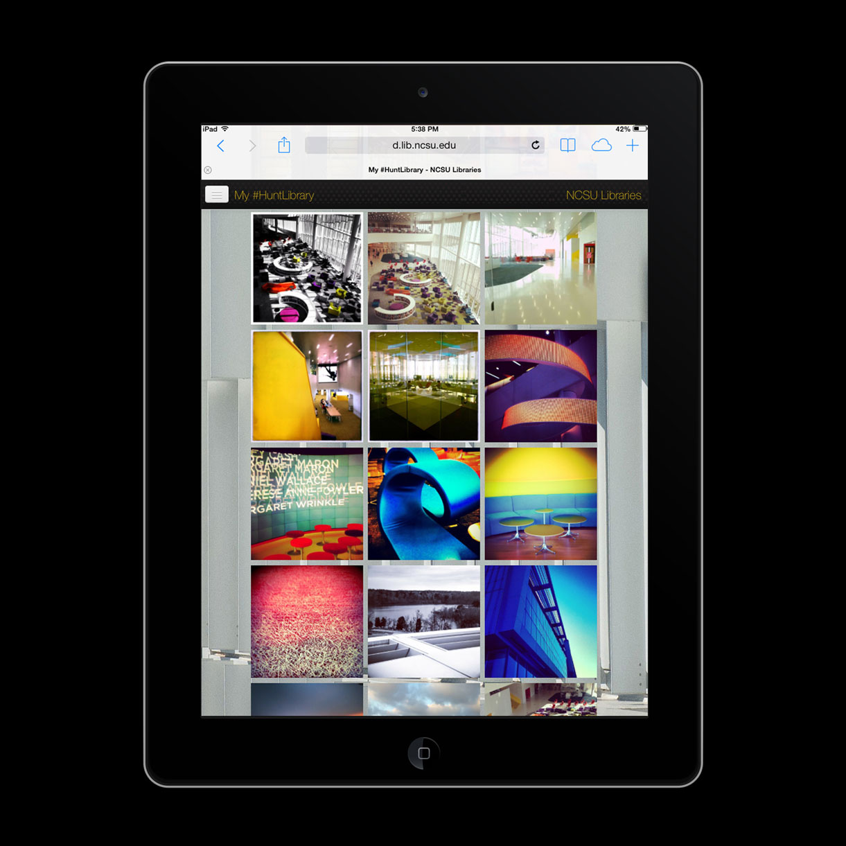
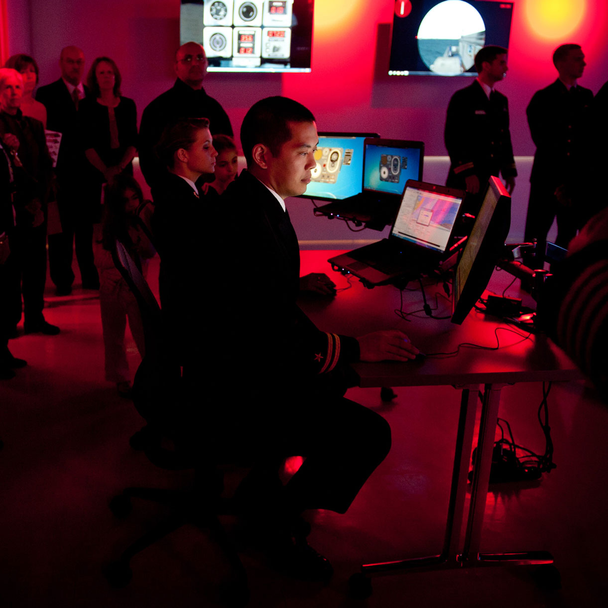
The Hunt Library’s lively immersive learning environments.
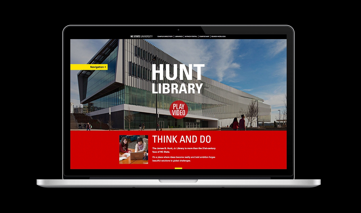
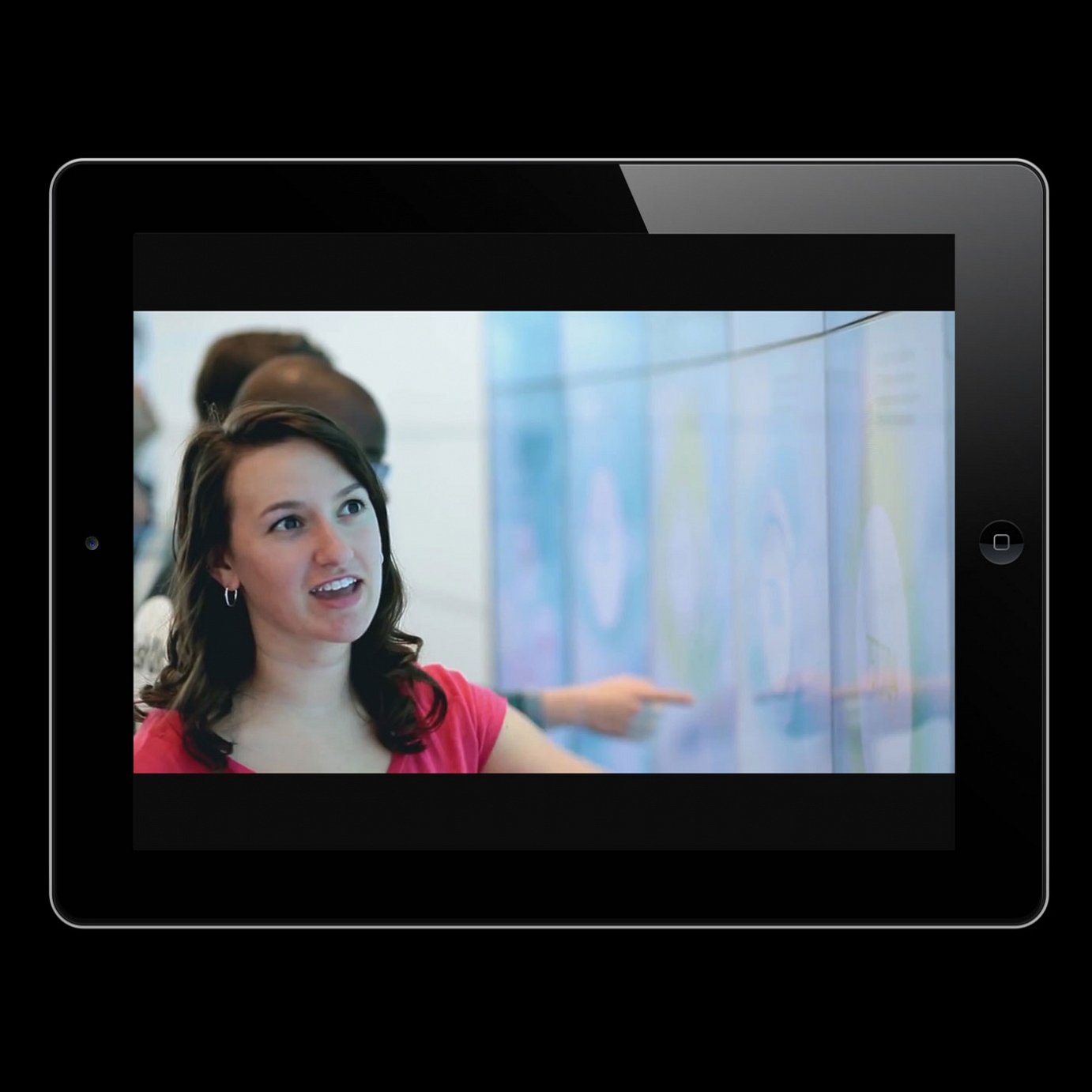
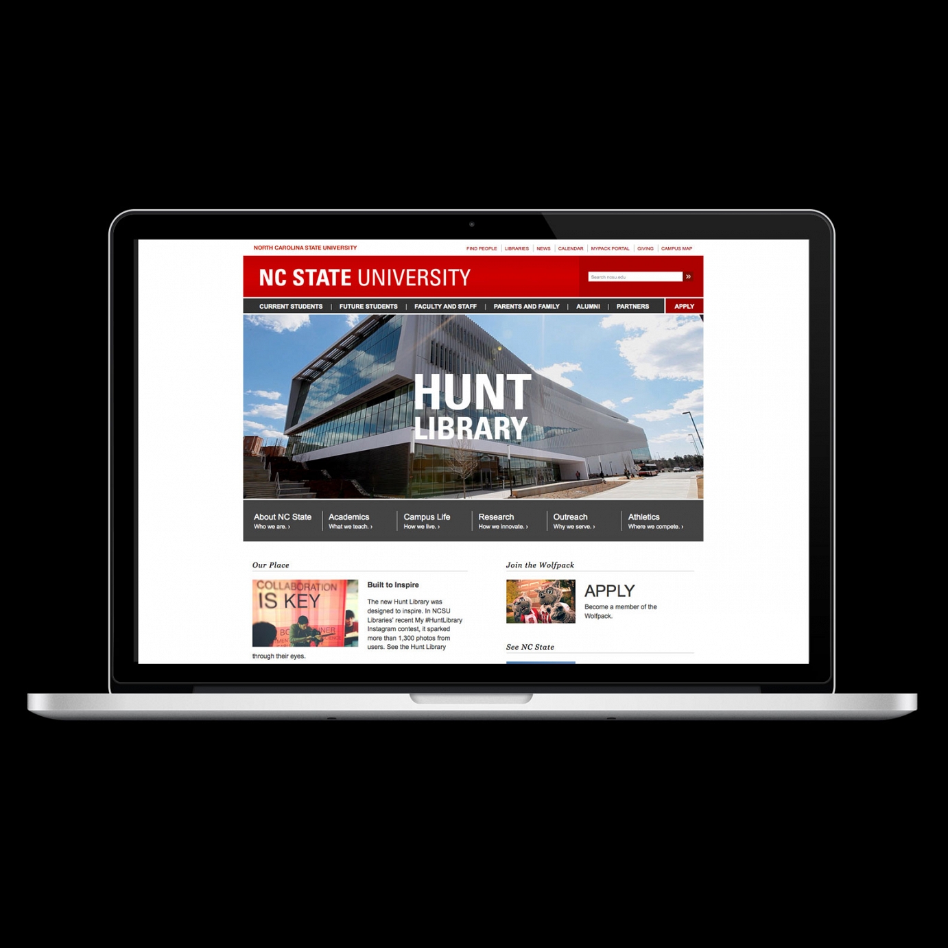
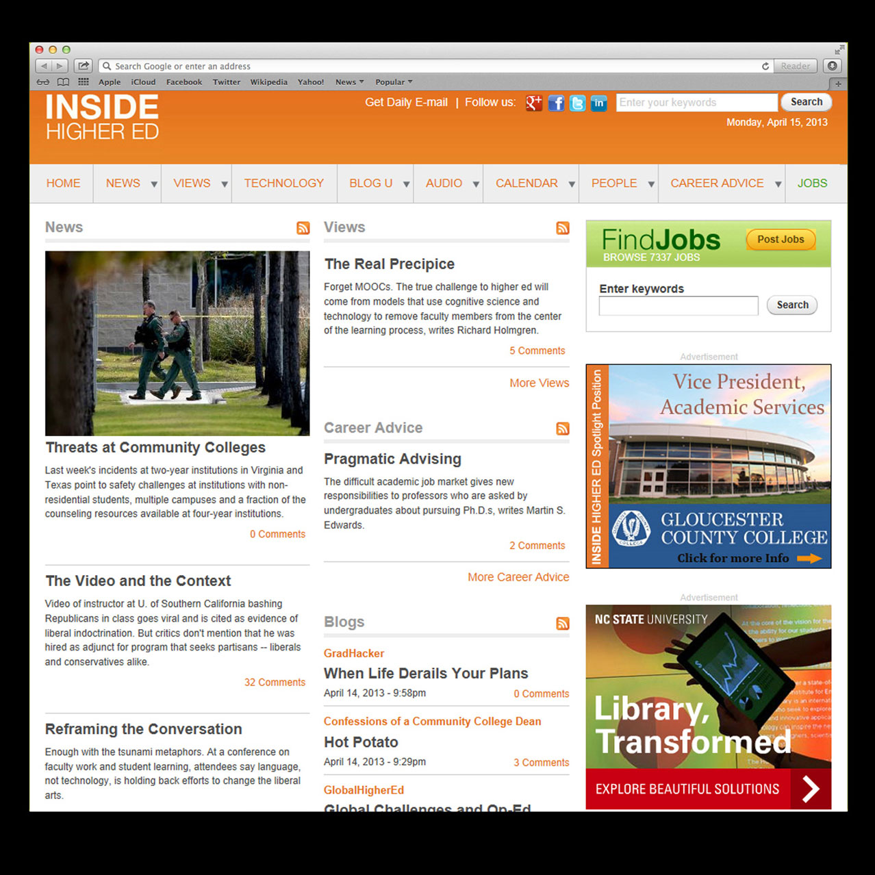
The Hunt Library Microsite
With an audacious, responsive design, the Hunt Library microsite includes a powerful video about the library; compelling stories about the library’s capacities for immersive teaching, solution-driven research, collaborative study, and economic impact; bold photography; and captivating infographics.
See more examples below.

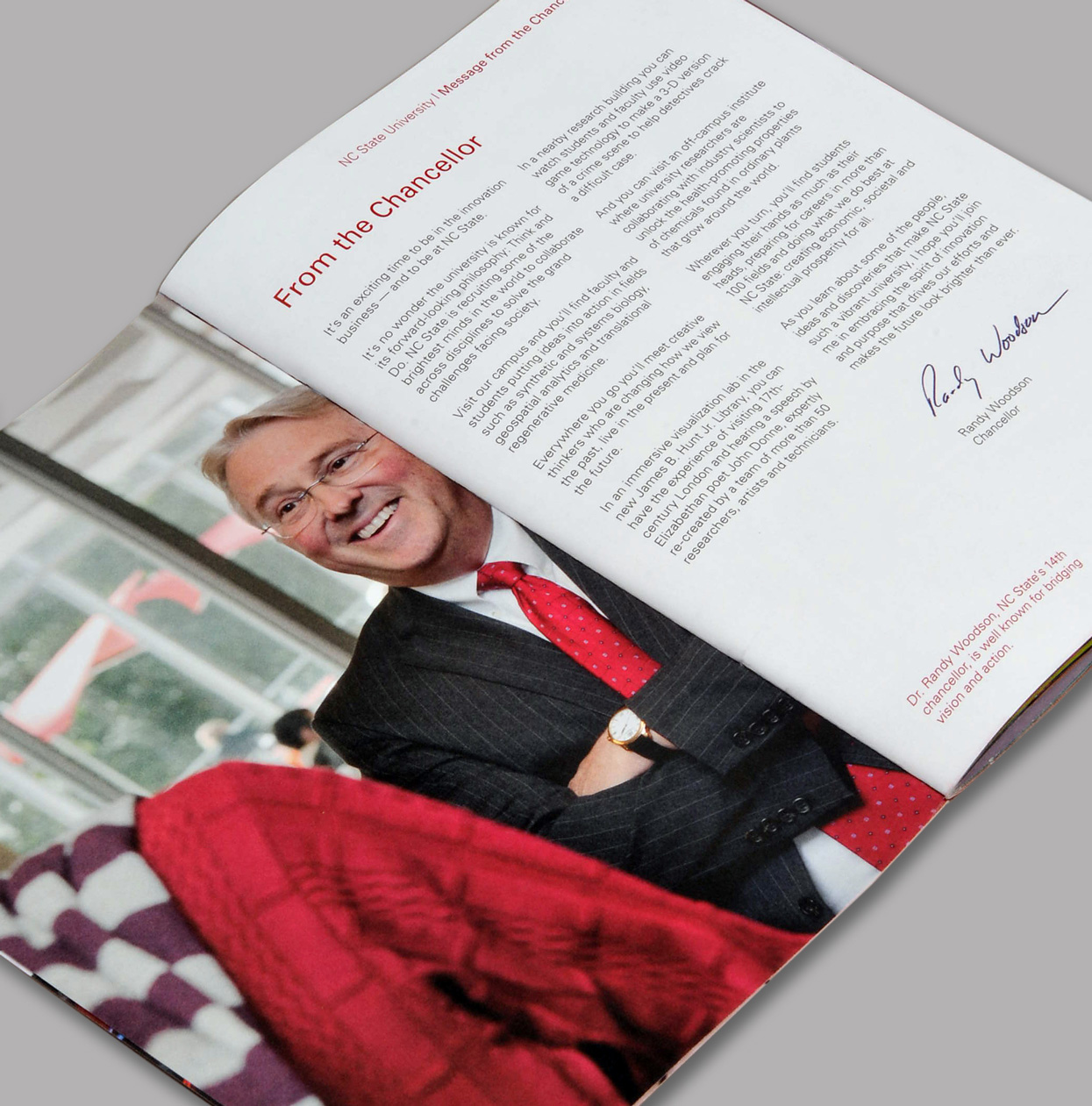
Setting the tone for the report, Chancellor Woodson reinforces our Think and Do philosophy in his opening letter.
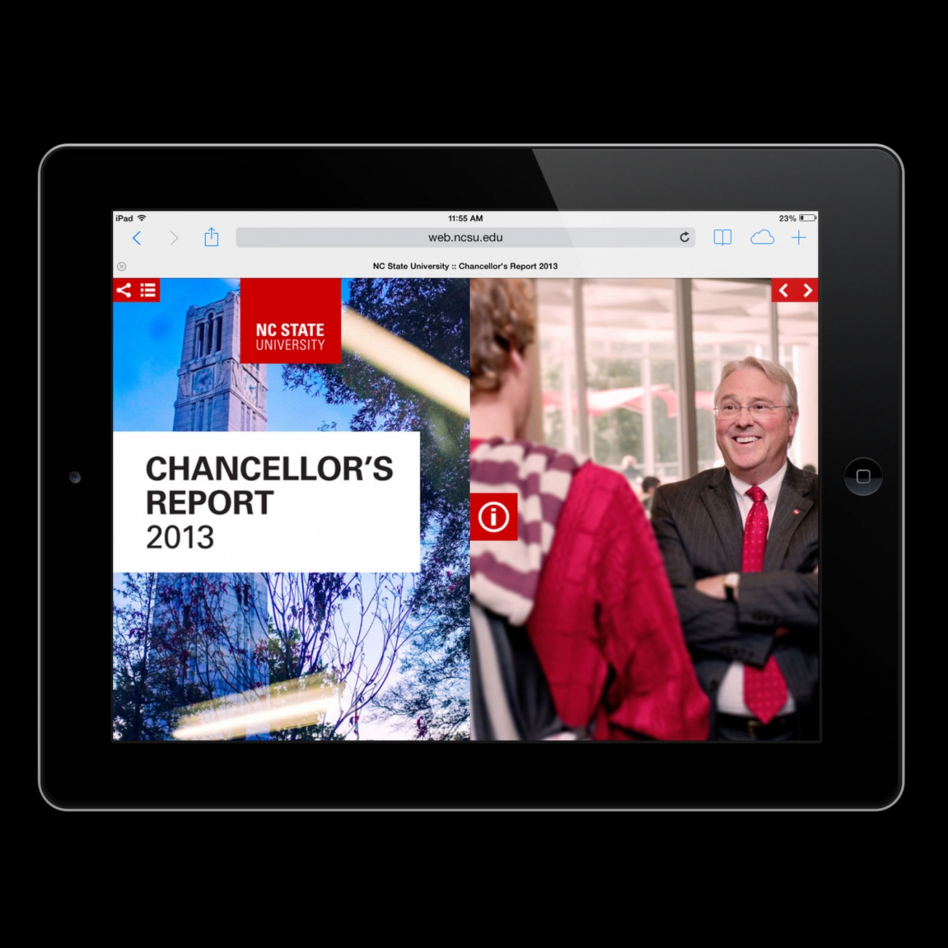
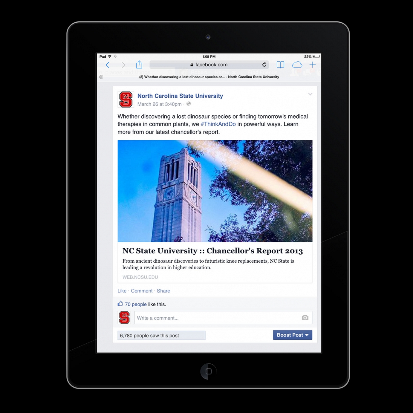
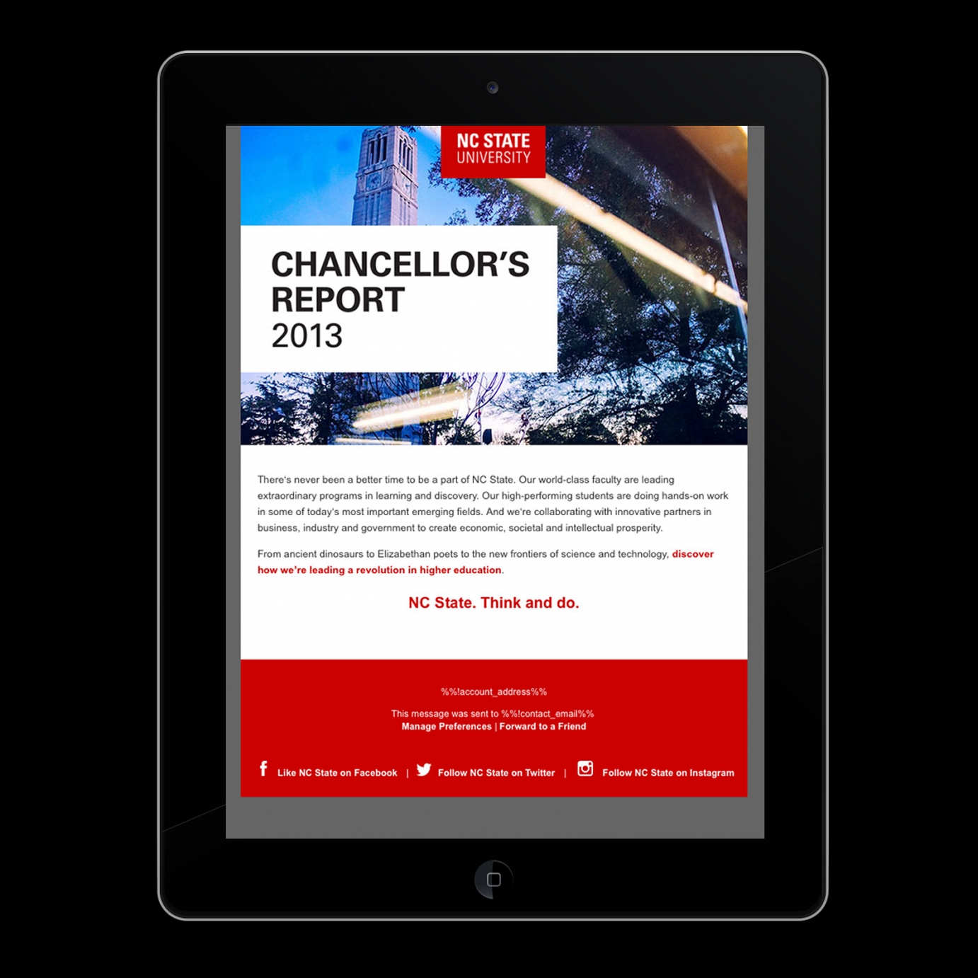
2013 Annual Report
Chancellor Woodson uses his annual report to tell key audiences the biggest stories of the previous year. Built to speak across multiple media, the report demonstrates how the university is making a difference.
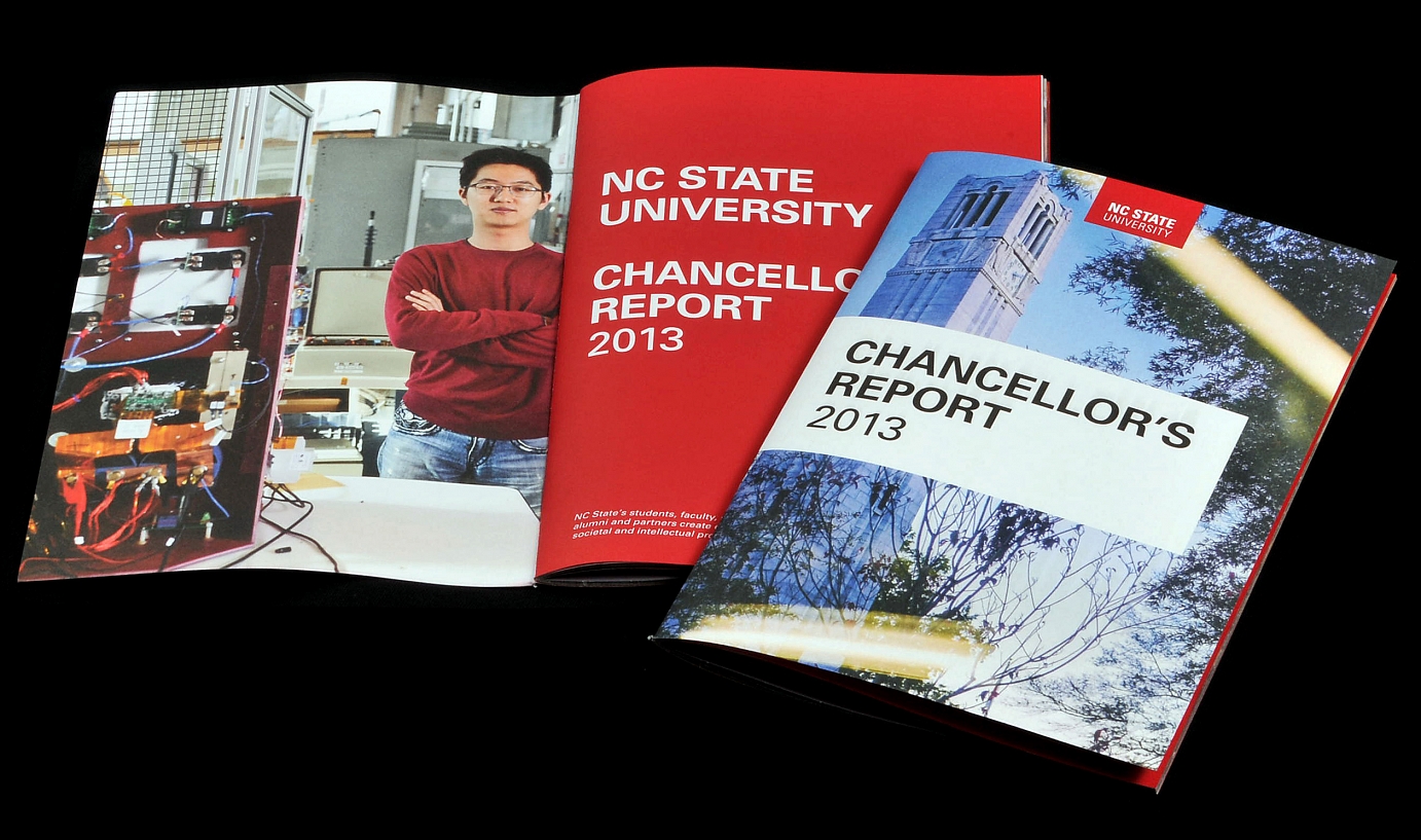
Printed Version
The printed report features full-page blocks of color and uses the secondary palette to help the reader navigate through similar stories.
See more examples below.